If you’ve spent any time browsing the web, you’ve seen sidebars. They show up everywhere: admin dashboards, documentation sites, school portals. Building one yourself is a practical way to get comfortable with CSS positioning, transitions and layout without touching JavaScript.
Designing a sidebar is one of the best ways for beginning developers to strengthen their core front-end HTML knowledge, CSS styling skills and real-world web layout experience.
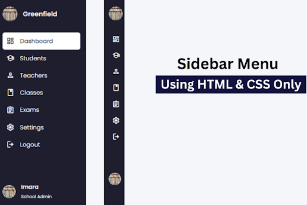
This guide walks you through designing a fully functional, responsive sidebar menu strictly with HTML and CSS. By default, the sidebar will be minimized, showing just icons representing menu items, it will smoothly expand when hovered to show the full text of the navigation links.
Steps to Create a Simple Sidebar Menu
Step 1: Set Up Your Project
Create a folder for your project with any name. Inside the folder, create two files:
- index.html — This will contain the HTML markup
- style.css — This will hold your CSS styling
Step 2: Write the HTML Markup
To start, add the following HTML codes to your index.html file.This code includes essential HTML markup with different semantic tags like,<aside>, <ul>, <li> and <a> to create the sidebar menu.
index.html
<!DOCTYPE html>
<html lang="en">
<head>
  <meta charset="UTF-8" />
  <meta name="viewport" content="width=device-width, initial-scale=1.0"/>
  <title> Sidebar Menu </title>
  <link rel="stylesheet"
        href="https://fonts.googleapis.com/css2?family=Material+Symbols+Outlined" />
  <link rel="stylesheet" href="style.css">
</head>
<body>
  <aside class="sidebar">
    <div class="sidebar-header">
      <img src="img.jpg" alt="School Logo" />
      <h2> Greenfield </h2>
    </div>
    <ul class="nav-links">
      <li><a href="#"><span class="material-symbols-outlined">dashboard</span>Dashboard</a></li>
      <li><a href="#"><span class="material-symbols-outlined">school</span>Students</a></li>
      <li><a href="#"><span class="material-symbols-outlined">person</span>Teachers</a></li>
      <li><a href="#"><span class="material-symbols-outlined">class</span>Classes</a></li>
      <li><a href="#"><span class="material-symbols-outlined">assignment</span>Exams</a></li>
      <li><a href="#"><span class="material-symbols-outlined">settings</span>Settings</a></li>
      <li><a href="#"><span class="material-symbols-outlined">logout</span>Logout</a></li>
    </ul>
div class="admin-info">
      <img src="img.jpg" alt="Admin Profile" />
      <div class="details">
        <h4> Imara </h4>
        <span> School Admin </span>
      </div>
    </div>
  </aside>
</body>
</html>
Step 3: Add CSS Styling
Now add the following styles to your style.css file to create an attractive navigation or sidebar menu.
style.css
<style>
    @import url('https://fonts.googleapis.com/css2?family=Poppins:wght@400;600&display=swap');

* {
  margin: 0;
  padding: 0;
  box-sizing: border-box;
  font-family: 'Poppins', sans-serif;
}

body {
  background-color: #f4f6fa;
  min-height: 100vh;
}

.sidebar {
  position: fixed;
  top: 0;
  left: 0;
  height: 100%;
  width: 60px;
  background: #1e1e2f;
  padding: 20px 15px;
  transition: width 0.3s ease;
  overflow-x: hidden;
}

.sidebar:hover {
  width: 240px;
}
.sidebar-header {
  display: flex;
  align-items: center;
}

.sidebar-header img {
    width: 40px;
    height: 40px;
  border-radius: 50%;
}

.sidebar-header h2 {
  color: white;
  font-size: 1.1rem;
  margin-left: 15px;
  white-space: nowrap;
  display: none;
}

.sidebar:hover .sidebar-header h2 {
  display: block;
}

.nav-links {
  list-style: none;
  margin-top: 30px;
}

.nav-links li a {
  display: flex;
  align-items: center;
  color: white;
  text-decoration: none;
  padding: 12px 10px;
  border-radius: 6px;
  transition:  0.3s;
}

.nav-links li a:hover {
  background: #ffffff;
  color: #1e1e2f;
}

.nav-links li a span {
  font-size: 22px;
  margin-right: 15px;
}

.admin-info {
  margin-top: 60px;
  display: flex;
  align-items: center;
  padding-top: 20px;
  color: white;
}
.admin-info img {
  width: 35px;
  height: 35px;
  border-radius: 50%;
  border: 2px solid white;
}

.admin-info .details {
  margin-left: 15px;
  display: none;
}

.sidebar:hover .admin-info .details {
  display: block;
}

.admin-info .details h4 {
  margin-bottom: 2px;
  font-size: 0.95rem;
}

.admin-info .details span {
  font-size: 0.75rem;
}


</style>
Step 4: Preview Your Sidebar Menu
Open your index.html file in a browser or use the Live Server extension in VS Code to see your styled sidebar menu in action.
Conclusion
Building a responsive sidebar menu with just HTML and CSS is a great hands-on project for entry-level web developers. Doing this teaches you the base of HTML markup and the strength of CSS while simultaneously giving you real-world experience in interactive and user-friendly layouts. You’ve been walked through creating the sidebar that starts very small with only icons and expands on hover to show full navigation links. Keep experimenting with the styles, icons, and layouts until you get your own creative touch out of it, as each line of code is a step to mastering front-end.
Check also: Create a Simple Login Form