If you are searching to add dark mode setting to a webpage without editing a single line of JavaScript, then this tutorial is just for you. Yes, it’s possible to implement a CSS dark mode toggle without JavaScript and the trick is a concept that has been around for years.
This project is created in plain HTML and CSS, no other technology has been used.Only a hidden checkbox and the general sibling combinator, along with CSS custom properties it does all the work.
At the end of this tutorial you will be able to create a working dark mode toggle, which will change the whole page to dark mode and light mode on a user’s click on a toggle button.
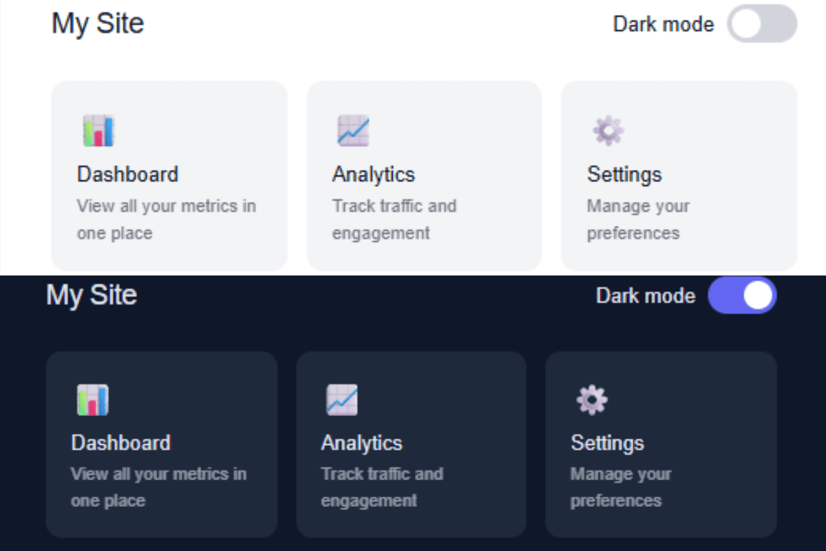
Here is what happens visually:
- The page is automatically loaded in light mode.
- The user will be presented with a toggle in the top-right corner.
- This will check the hidden checkbox when it is clicked.
- The checked state will activate a CSS rule which will change the background colour(s), text colour(s) and border colour(s) for the entire page.
- If you click on it again, it will be unchecked and everything will be restored.
The toggle button itself is a <label> element connected to the checkbox via a matching id and for attribute. The check box is never displayed because its display: none property is set. The label is the one that the user is clicking.
This minimal version comes with no built-in animations, but you can easily create a color swap animation on the body, that’s covered in the CSS section of this tutorial.
How to Create a CSS Dark Mode Toggle Without JavaScript
Step 1: Create Your Project Folder
Make a new folder called css-dark-mode-toggle. Inside it, create two files:
index.htmlstyle.css
That is all you need for this project.
Step 2: Create the HTML File
The HTML structure has three key pieces: the hidden checkbox, the label that acts as the toggle button, and the page content.
index.html:
<!DOCTYPE html>
<html lang="en">
<head>
  <meta charset="UTF-8" />
  <meta name="viewport" content="width=device-width, initial-scale=1.0" />
  <title>CSS Dark Mode Toggle</title>
  <link rel="stylesheet" href="style.css" />
</head>
<body>

  <input type="checkbox" id="dark-toggle">

  <div class="page-shell">
    <div class="toggle-row">
      <span class="site-title">My Site</span>
      <label class="toggle-label" for="dark-toggle">
        Dark mode
        <div class="toggle-track">
          <div class="toggle-thumb"></div>
        </div>
      </label>
    </div>

    <div class="card-grid">
      <div class="card">
        <div class="card-icon">📊</div>
        <div class="card-title">Dashboard</div>
        <div class="card-desc">View all your metrics in one place</div>
      </div>
      <div class="card">
        <div class="card-icon">📈</div>
        <div class="card-title">Analytics</div>
        <div class="card-desc">Track traffic and engagement</div>
      </div>
      <div class="card">
        <div class="card-icon">⚙️</div>
        <div class="card-title">Settings</div>
        <div class="card-desc">Manage your preferences</div>
      </div>
    </div>
  </div>

</body>
</html>- The
<input id="dark-toggle">is placed before.page-shellin the DOM. This position matters. The~combinator only targets elements that come after the checkbox in the source order. - The
<label for="dark-toggle">is what the user actually clicks. It is linked to the checkbox by the matchingidandforvalues. - The entire visible page is wrapped in
.page-shell. This is the element the CSS targets when the checkbox is checked.
Step 3: Add the CSS
Add CSS codes to your style.css file to make your dark mode toggle functional and visually appealing. You can play with colors, fonts, background etc., anything you want, to make it even more beautiful.
style.css:
* {
  margin: 0;
  padding: 0;
  box-sizing: border-box;
}

body {
  font-family: sans-serif;
  padding: 40px;
}

/* Hide the checkbox */
#dark-toggle {
  display: none;
}

/* Light mode defaults */
.page-shell {
  background: #ffffff;
  color: #111827;
  transition: background 0.3s, color 0.3s;
  padding: 28px 32px;
  min-height: 220px;
  border-radius: 12px;
  border: 1px solid #e5e7eb;
}

/* Dark mode styles */
#dark-toggle:checked ~ .page-shell {
  background: #0f172a;
  color: #e2e8f0;
  border-color: #1e293b;
}

/* Header row */
.toggle-row {
  display: flex;
  align-items: center;
  justify-content: space-between;
  margin-bottom: 24px;
}

.site-title {
  font-size: 18px;
  font-weight: 500;
  letter-spacing: -0.3px;
}

/* Toggle label */
.toggle-label {
  display: flex;
  align-items: center;
  gap: 8px;
  cursor: pointer;
  font-size: 13px;
  color: inherit;
  user-select: none;
}

/* Toggle track (pill background) */
.toggle-track {
  width: 44px;
  height: 24px;
  border-radius: 12px;
  background: #d1d5db;
  position: relative;
  transition: background 0.25s;
  flex-shrink: 0;
}

/* Toggle thumb (sliding circle) */
.toggle-thumb {
  width: 18px;
  height: 18px;
  border-radius: 50%;
  background: #ffffff;
  position: absolute;
  top: 3px;
  left: 3px;
  transition: transform 0.25s;
}

/* Move thumb right when checked */
#dark-toggle:checked ~ .page-shell .toggle-thumb {
  transform: translateX(20px);
}

/* Change track color when checked */
#dark-toggle:checked ~ .page-shell .toggle-track {
  background: #6366f1;
}

/* Card grid */
.card-grid {
  display: grid;
  grid-template-columns: repeat(3, 1fr);
  gap: 12px;
}

/* Individual card */
.card {
  border-radius: 10px;
  padding: 16px;
  background: #f3f4f6;
  transition: background 0.3s;
}

#dark-toggle:checked ~ .page-shell .card {
  background: #1e293b;
}

.card-icon {
  font-size: 20px;
  margin-bottom: 8px;
}

.card-title {
  font-size: 13px;
  font-weight: 500;
  margin-bottom: 4px;
}

.card-desc {
  font-size: 11px;
  opacity: 0.6;
  line-height: 1.5;
}

/* Responsive */
@media (max-width: 500px) {
  body {
    padding: 20px;
  }
  .card-grid {
    grid-template-columns: 1fr;
  }
}
Step 4: Test the Project
Click on index.html in your browser. You should see a light version of this page with a light/dark mode toggle in the header. The toggle should instantly toggle the page to dark mode when clicked. The second click will switch back to light mode.
Conclusion
A CSS dark mode toggle without JavaScript with a hidden checkbox, a label and the CSS sibling combinator and some CSS custom properties. Everything is neat and tidy, the code is easy to read and it can be easily modified to work with any site by changing the values of variables.
The code listed above is a good foundation to build upon. You can use it in an actual project, taking the liberty to modify the colors as you see fit.
You May Like: Create a Simple Sidebar Menu Using HTML and CSS